DataPlotly 3.7
DataPlotly
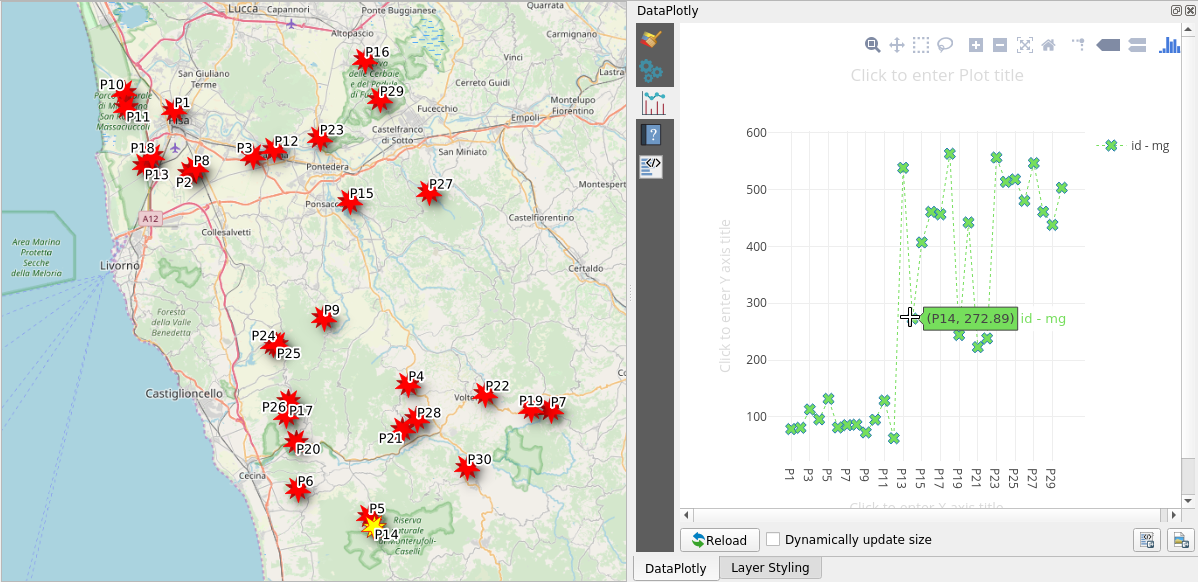
DataPlotly is a QGIS plugin that allows the user to create interactive D3 like charts based on vector data.
Published by Faunalia
Technical contact Matteo Ghetta
Vitality:
81%
The vitality index, as explicited in the guidelines for the acquisition and reuse of software for Italian PA, is calculated according to the following four main categories:
- Code activity: the daily number of commits and merges;
- Release history: the daily number of releases;
- User community: the number of unique authors;
- Longevity: the age of the project.
The ranges of every measure can be found in the vitality-ranges.yml file.
Development status: stable
Software functionality
qgis
plotly
dataviz
python
charts
detailed information
DataPlotly 3.7
DataPlotly
Last release 2020-05-20 (3.7)
Type of maintenance internal
License GPL-2.0
Platforms
linux
windows
mac
Enabling platforms None
Compliance None
List of dependencies
OSS
QGIS
Supported languages
English
Italian
Swedish
Dutch
Spanish
Extended description
With the DataPlotly plugin for QGIS the user can create fully customized and fully interactive D3 like charts withing QGIS itself. Currently 10 different charts are available (scatter plot, pie chart, bar plot, polar plot, boxplot, contour plot, density chart, histogram, polar chart, violin plot, ternary plot). The plugin is also available in the Layout and Report composer in order to enrich the cartographic export as a dataviz like tool. Within the Layout and Report composer it is also available in Atlas mode.